Background
This library is a collection of functions that I created when working on the COVID-19 pandemic. The main focus of this was integrating geospatial demographic, hospital capacity and COVID data from England, Scotland, Wales and Northern Ireland, all of which were available on different sites and methods. The UK has a wide range of administrative geographic boundaries for different purposes and moving from different scales and resolutions proved necessary. As the geospatial operations are quite time consuming but don’t need to be repeated the ability to cache results of geospatial transformations is useful and embedded into these functions.
library(tidyverse)
#> ── Attaching core tidyverse packages ──────────────────────── tidyverse 2.0.0 ──
#> ✔ dplyr     1.1.4     ✔ readr     2.1.5
#> ✔ forcats   1.0.0     ✔ stringr   1.5.2
#> ✔ ggplot2   4.0.0     ✔ tibble    3.3.0
#> ✔ lubridate 1.9.4     ✔ tidyr     1.3.1
#> ✔ purrr     1.1.0
#> ── Conflicts ────────────────────────────────────────── tidyverse_conflicts() ──
#> ✖ dplyr::filter() masks stats::filter()
#> ✖ dplyr::lag()    masks stats::lag()
#> ℹ Use the conflicted package (<http://conflicted.r-lib.org/>) to force all conflicts to become errors
library(patchwork)
library(arear)

# the usual setup would be to place downloaded files in either a user cache directory or a tempdir.:
# however this does not seem to work well in github actions.

options("arear.download.dir" = rappdirs::user_cache_dir("arear-download"))
options("arear.cache.dir" = rappdirs::user_cache_dir("arear-vignette"))

ggplot2::theme_set(
  ggplot2::theme_bw(base_size = 8)+arear::mapTheme()
)
Maps and capacity data
Getting UK map files that relate to standardised geographical codes supplied with the COVID data from the different devolved administrations was wrapped into the following functions. These download, cache and rename the maps to have a consistent naming convention:
arear::listStandardMaps()
#>  [1] "WD11"            "WD19"            "LSOA11"          "MSOA11"
#>  [5] "DZ11"            "CA19"            "HB19"            "LHB19"
#>  [9] "CTYUA19"         "LAD19"           "LAD20"           "CCG20"
#> [13] "NHSER20"         "PHEC16"          "CTRY19"          "LGD12"
#> [17] "OUTCODE"         "GBR_ISO3166_2"   "GBR_ISO3166_3"   "GOOGLE_MOBILITY"
map = arear::getMap("CTRY19")
In March 2019, the capacity of the NHS to deal with acutely unwell patients was added to by reconfiguration of clinical areas such as cardiac catheterisation labs, or surgical recovery units, to provide acute respiratory support. This was also increased by addition of capacity from private providers. To model the impact of COVID on regional health services we curated a data set of NHS and non-NHS providers. The curated data lists hospitals, some capacity estimates and their geographical location:
nhshospitals = arear::surgecapacity %>%
  dplyr::filter(sector == "NHS Sector")

ggplot()+
  ggplot2::geom_sf(data=map)+
  ggplot2::geom_sf(data=nhshospitals,ggplot2::aes(colour=tier1),size=0.5)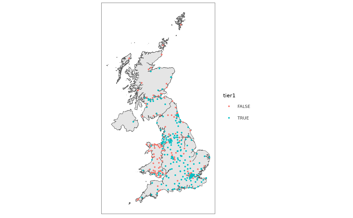
A similar set of data is bundled with the library for fine grained demographic estimates for both adults and elderly adults the start of the pandemic, with an associated map shapefile.
Containment
Finding out which hospitals were in which geographic area can be done easily in sf, but getting the library can get the result conveniently as a mapping between code sets. The following allows us to assign hospitals to specific regions and hence work out capacity stats at different levels of geography - In this case at the NHS regional level:
nhser = arear::getMap("NHSER20")
hospitalId2nhser = arear::getContainedIn(
  nhshospitals %>% dplyr::group_by(hospitalId, hospitalName),
  nhser %>% dplyr::group_by(code,name)
)
#> although coordinates are longitude/latitude, st_contains assumes that they are
#> planar

hospitalsByNhser = nhshospitals %>%
  dplyr::inner_join(hospitalId2nhser,by=c("hospitalId","hospitalName"))

ggplot()+
  ggplot2::geom_sf(data=nhser)+
  ggplot2::geom_sf(data = hospitalsByNhser,ggplot2::aes(colour=name),size=0.5)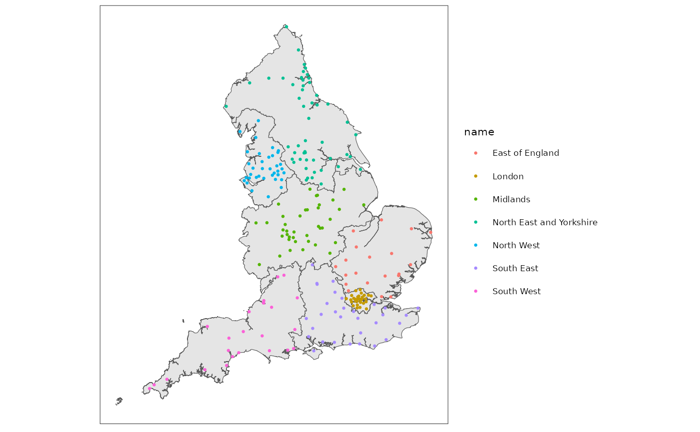
And hence we can estimate capacity at the NHS regional level:
nhserBeds = hospitalsByNhser %>%
  tibble::as_tibble() %>%
  dplyr::group_by(code,name) %>%
  dplyr::summarise(
    acuteBeds = sum(acuteBeds),
    hduBeds = sum(hduBeds)
  )
#> `summarise()` has grouped output by 'code'. You can override using the
#> `.groups` argument.

nhserBeds
#> # A tibble: 7 × 4
#> # Groups:   code [7]
#>   code      name                     acuteBeds hduBeds
#>   <chr>     <chr>                        <dbl>   <dbl>
#> 1 E40000003 London                       11851    1814
#> 2 E40000005 South East                   13033    1485
#> 3 E40000006 South West                    9543    1149
#> 4 E40000007 East of England               9518     747
#> 5 E40000008 Midlands                     17473    1452
#> 6 E40000009 North East and Yorkshire     16133    1458
#> 7 E40000010 North West                   14584     887
Intersection
Mapping between different levels of granularity needs a many to many weighted mapping. This is essentially an area intersection. Here we see the intersection between Public Health England regions, which were used for the React study amongst others, and NHS regions.
phec = arear::getMap("PHEC16")
phecNhser = arear::getIntersection(phec,nhser)

p1 = ggplot2::ggplot()+ggplot2::geom_sf(data=nhser,colour="red")
p2 = ggplot2::ggplot()+ggplot2::geom_sf(data=phec,colour="blue")
p3 = ggplot2::ggplot()+ggplot2::geom_sf(data=phecNhser)

p1+p2+p3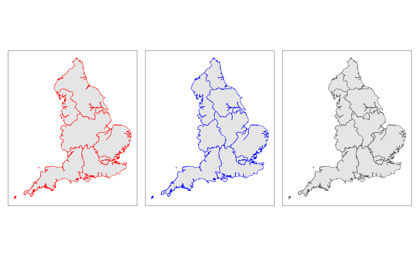
# Detecting foll coverage can be done by looking at the sum of the fractional areas in the resulting intersection
# tmp = phecNhser %>% tibble::as_tibble() %>% dplyr::mutate(frac = intersectionArea/area.y)
# tmp %>% dplyr::group_by(name.y) %>% dplyr::summarise(cov = sum(frac))
Areal interpolation
There are other ways of doing this but if all the information you have are the areas and the summary capacity figures you can convert the NHS regional bed capacity figures into PHE centre bed capacity figures using areal interpolation, this version is dplyr friendly and operates on grouped data:
tmpBedsCount = nhserBeds %>%
  tidyr::pivot_longer(cols = c(acuteBeds,hduBeds), names_to="type", values_to="beds") %>%
  dplyr::group_by(type)


phecBeds =
  arear::interpolateByArea(
    tmpBedsCount,
    inputShape = nhser, by="code",
    interpolateVar = beds,
    outputShape = phec %>% dplyr::group_by(name,code)
  )
#> Linking to GEOS 3.12.1, GDAL 3.8.4, PROJ 9.4.0; sf_use_s2() is FALSE
#> Warning: Unknown or uninitialised column: `area`.

phecBeds %>%
  dplyr::ungroup() %>%
  tidyr::pivot_wider(names_from = type, values_from = beds)
#> # A tibble: 9 × 4
#>   name                 code      acuteBeds hduBeds
#>   <chr>                <chr>         <dbl>   <dbl>
#> 1 East Midlands        E45000016     9915.    821.
#> 2 East of England      E45000017     9351.    734.
#> 3 London               E45000001    11846.   1813.
#> 4 North East           E45000009     4691.    424.
#> 5 North West           E45000018    16922.   1111.
#> 6 South East           E45000019    13074.   1489.
#> 7 South West           E45000020     9530.   1147.
#> 8 West Midlands        E45000005     8238.    685.
#> 9 Yorkshire and Humber E45000010     8553.    767.
Geography as network
The spread of COVID between different areas depends on the connections between areas. Whilst this has a lot to do with commuting and transport networks, there is an element which is due to geographical proximity. The redistribution of hospitalised cases between different regions may also be driven by nearby capacity. The library makes it easier to represent the geography as a network and in this example we investigate local authority districts (LAD) and weight the nodes of that network by the number of beds in each LAD. The result is just about recognizably the UK but lying on its side. If you want a more geographical view of the network each node has the SF polygon in it so with some processing this can be converted into a centroid and these co-ordinates used to lay out the graph.
lad = arear::getMap("LAD19")

tmp = arear::surgecapacity %>%
  dplyr::group_by(hospitalId, hospitalName, acuteBeds, hduBeds) %>%
  arear::getContainedIn(lad %>% dplyr::group_by(code,name)) %>%
  dplyr::group_by(code,name) %>% dplyr::summarise(beds = sum(acuteBeds+hduBeds))
#> although coordinates are longitude/latitude, st_contains assumes that they are
#> planar
#> `summarise()` has grouped output by 'code'. You can override using the
#> `.groups` argument.

nodes = lad %>%
  dplyr::left_join(tmp,by=c("code","name")) %>%
  dplyr::mutate(beds=ifelse(is.na(beds),0,beds)) %>%
  dplyr::ungroup()

edges = lad %>% arear::createNeighbourNetwork()
#> although coordinates are longitude/latitude, st_contains assumes that they are
#> planar
#> although coordinates are longitude/latitude, st_contains assumes that they are
#> planar
#> although coordinates are longitude/latitude, st_intersects assumes that they
#> are planar
#> Warning in spdep::poly2nb(shape %>% sf::as_Spatial(), queen = queen): some observations have no neighbours;
#> if this seems unexpected, try increasing the snap argument.
#> Warning in spdep::poly2nb(shape %>% sf::as_Spatial(), queen = queen): neighbour object has 8 sub-graphs;
#> if this sub-graph count seems unexpected, try increasing the snap argument.

# The node_key value is the magic incantation that makes this work:
graph = tidygraph::tbl_graph(nodes = nodes,edges=edges,node_key = "code")

ggraph::ggraph(graph, layout="kk")+
  ggraph::geom_edge_link() +
  ggraph::geom_node_point(ggplot2::aes(size=beds))+
  ggplot2::scale_size_area(max_size = 4)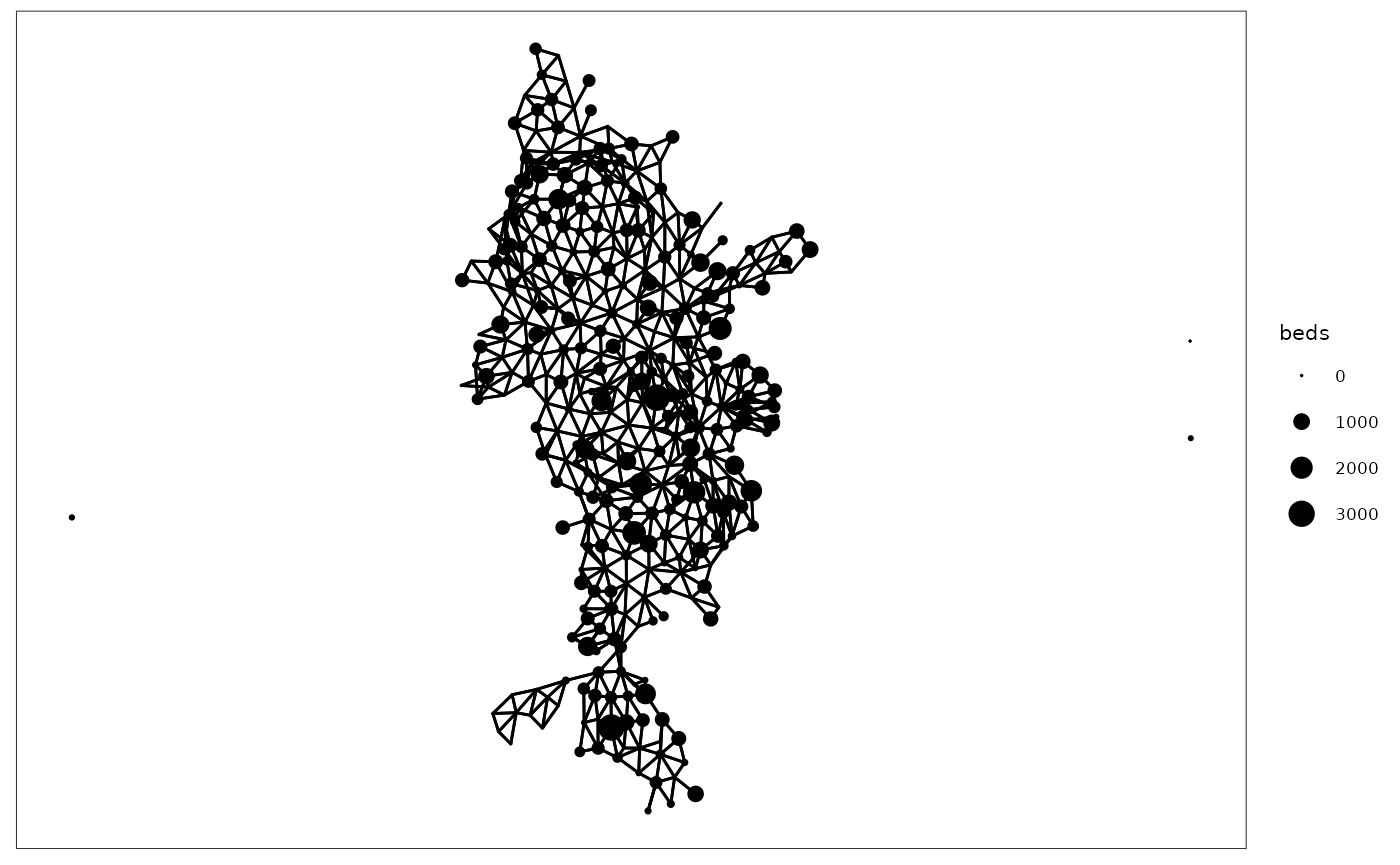
Preview a map with points of interest overlaid
Previewing a zoomable map with points of interest for debugging is made simpler with the preview function:
arear::preview(
      shape = lad,
      poi=nhshospitals,
      poiLabelGlue = "{hospitalName}",
      poiPopupGlue =
        "<b>{hospitalName}</b><ul><li>{trustName}</li><li>hdu: {hduBeds}</li><li>acute: {acuteBeds}</li></ul>"
)
Estimating the catchment areas of hospitals.
Prior to any hospital activity data for COVID being available, we developed an algorithm for predicting the catchment areas of a set of hospitals, by looking at both the location of supply of hospital beds and the local demand in terms of population. This is described in detail in the paper: R. J. Challen, G. J. Griffith, L. Lacasa, and K. Tsaneva-Atanasova, ‘Algorithmic hospital catchment area estimation using label propagation’, BMC Health Services Research, vol. 22, no. 1, p. 828, June 2022, (doi: 10.1186/s12913-022-08127-7). A general aim of the algorithm is to try and distribute supply to demand evenly given geographical constraints, and keeping areas contiguous.
# this limits to england only NHS trusts.
supply = arear::surgecapacity %>%
  dplyr::semi_join(arear::apiTrusts, by = c("trustId"="area_code")) %>%
  dplyr::mutate(beds = acuteBeds+hduBeds)

demand = arear::uk2019demographicsmap() %>%
  dplyr::filter(code %>% stringr::str_starts("E")) %>% # easy way to get england only.
  dplyr::left_join(
    arear::uk2019adultpopulation %>%
      dplyr::select(-name,-codeType), by="code"
  )

# devtools::load_all()

catchment = arear::createCatchment(
  supplyShape = supply,
  supplyIdVar = trustId,
  supplyVar = beds,
  demandShape = demand,
  demandIdVar = code,
  demandVar = population,
  outputMap = TRUE
)
#> although coordinates are longitude/latitude, st_contains assumes that they are
#> planar
#> although coordinates are longitude/latitude, st_contains assumes that they are
#> planar
#> although coordinates are longitude/latitude, st_intersects assumes that they
#> are planar
#> Warning in spdep::poly2nb(shape %>% sf::as_Spatial(), queen = queen): some observations have no neighbours;
#> if this seems unexpected, try increasing the snap argument.
#> although coordinates are longitude/latitude, st_contains assumes that they are
#> planar
#> Warning in eval(expr, envir = rlang::caller_env()): More than one supplier was
#> found in a single region. These the first value will be picked, and the total
#> capacity combined, but as a result the catchment map will be missing some
#> values from the supplier list.
#> areas remaining: 32624;
#> growing into: 1450
#> areas remaining: 32450; growing into: 1676
#> areas remaining: 31785; growing into: 2553
#> areas remaining: 31180; growing into: 3210
#> areas remaining: 30058; growing into: 4046
#> areas remaining: 28873; growing into: 4825
#> areas remaining: 27134; growing into: 5593
#> areas remaining: 25316; growing into: 6280
#> areas remaining: 23043; growing into: 6795
#> areas remaining: 20469; growing into: 7109
#> areas remaining: 18072; growing into: 7241
#> areas remaining: 15443; growing into: 7057
#> areas remaining: 12726; growing into: 6384
#> areas remaining: 10329; growing into: 5557
#> areas remaining: 8493; growing into: 4828
#> areas remaining: 6677; growing into: 3932
#> areas remaining: 5405; growing into: 3201
#> areas remaining: 4199; growing into: 2531
#> areas remaining: 3406; growing into: 2044
#> areas remaining: 2781; growing into: 1662
#> areas remaining: 2133; growing into: 1272
#> areas remaining: 1646; growing into: 1038
#> areas remaining: 1330; growing into: 838
#> areas remaining: 1090; growing into: 651
#> areas remaining: 916; growing into: 542
#> areas remaining: 703; growing into: 433
#> areas remaining: 530; growing into: 306
#> areas remaining: 408; growing into: 247
#> areas remaining: 351; growing into: 206
#> areas remaining: 254; growing into: 130
#> areas remaining: 204; growing into: 108
#> areas remaining: 135; growing into: 60
#> areas remaining: 119; growing into: 51
#> areas remaining: 89; growing into: 37
#> areas remaining: 75; growing into: 33
#> areas remaining: 58; growing into: 12
#> areas remaining: 57; growing into: 11
#> areas remaining: 46; growing into: 2
#> areas remaining: 44; growing into: 0
#> Warning in eval(expr, envir = rlang::caller_env()): No futher areas to grow
#> into. Terminating early with missing areas - it looks like 44 areas are not
#> connected.
#> assembling catchment area map...

catchmentMap = catchment$map %>% dplyr::mutate(bedsPer100K = beds / (population/100000))


ggplot(catchmentMap)+
  ggplot2::geom_sf(mapping = ggplot2::aes(fill = bedsPer100K), size=0.1, colour="white")+
  ggplot2::scale_fill_viridis_c(limit=c(NA,400), oob=scales::squish)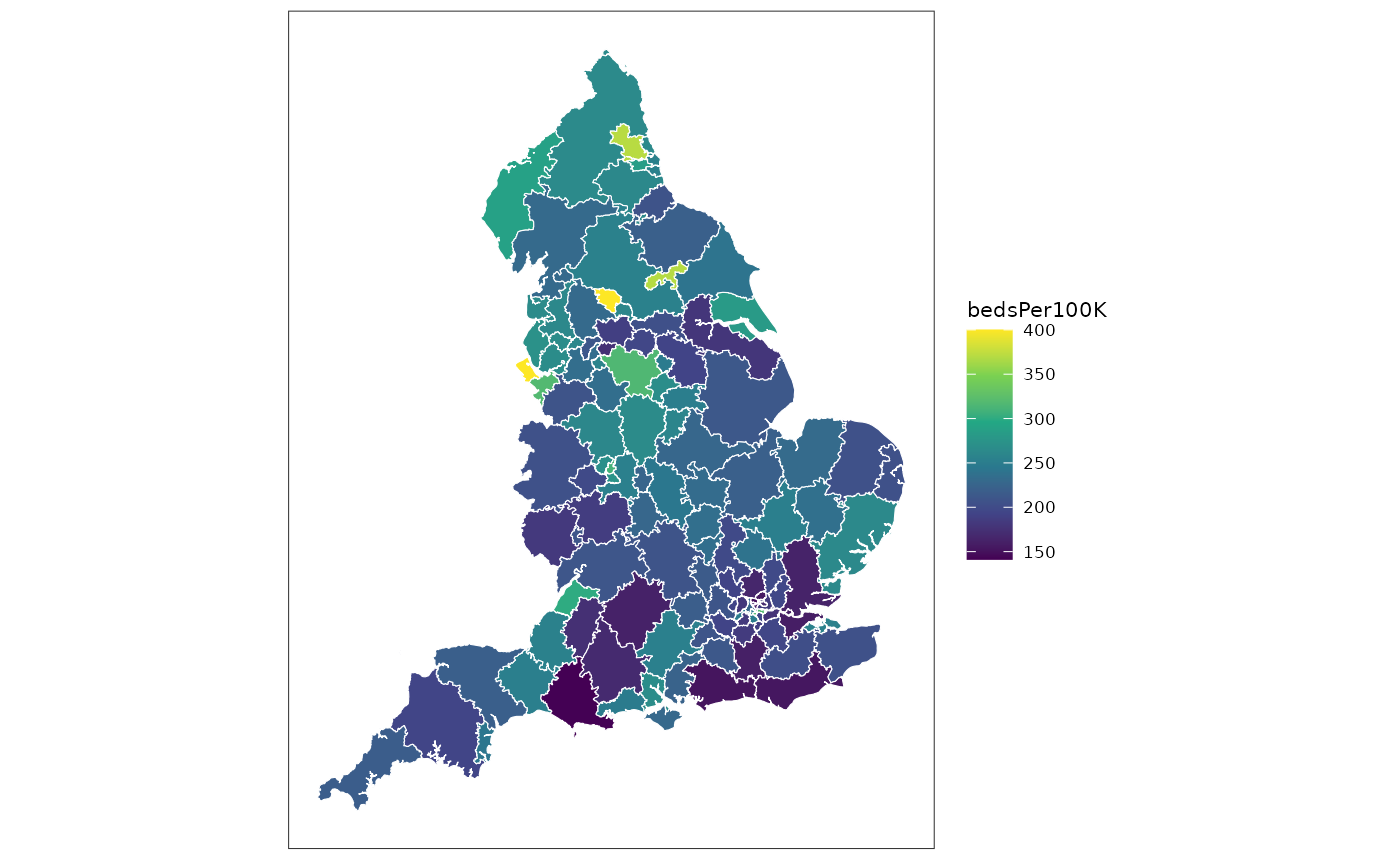
# catchment$map %>% glimpse()Displaying e.g. London as a popout
This is made easier by a function which creates a scaled copy of any mask (defaults to London) in a corner of choice
mapWithPopout = catchmentMap %>%
  arear::popoutArea(
    popoutPosition = "NE",
    popoutScale = 3,
    nudgeX = 0.25,
    nudgeY = 0.25
  )
#> although coordinates are longitude/latitude, st_union assumes that they are
#> planar
#> although coordinates are longitude/latitude, st_intersection assumes that they
#> are planar
#> Warning: attribute variables are assumed to be spatially constant throughout
#> all geometries

ggplot(mapWithPopout)+
  ggplot2::geom_sf(
    mapping = ggplot2::aes(fill = bedsPer100K),
    size=0.1, colour="white"
  )+
  ggplot2::scale_fill_viridis_c(limit=c(NA,400), oob=scales::squish)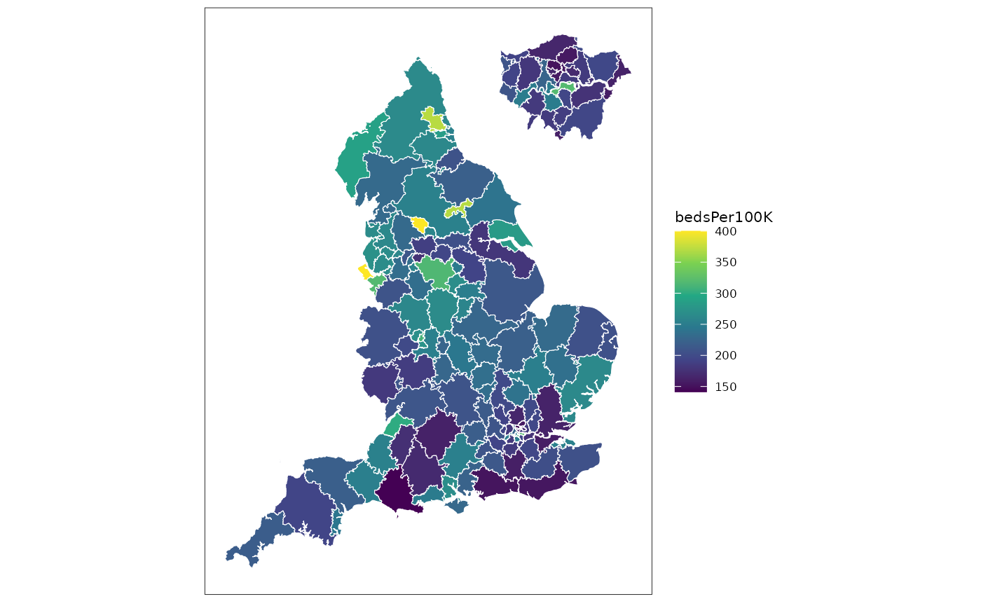
Facetted plot labelling
It is useful to be able to highlight regions by name on maps according to some criteria (usually the top N regions on a chloropleth). This is useful when combined with faceting and with popouts to highlight areas. The library includes a specialised map drawing function that allows a short label to be drawn on the map and provides a lookup table to get the full name of the feature. This is particularly useful for time-series.
# Investigate the timeseries of cases at 4 date points
maxDate = as.Date("2021-03-01")
dateFacets = seq(maxDate,by = -14,length.out = 6)

# make sure the data is complete and no missing zero values
apiTrusts2 = apiTrusts %>%
  dplyr::filter(date %in% dateFacets) %>%
  tidyr::complete(
    tidyr::nesting(area_code,area_type,area_name),
    date,
    fill=list(value=0)
  )

mapTs = mapWithPopout %>%
  dplyr::left_join(apiTrusts2, by = c("trustId" = "area_code"))
#> Warning in sf_column %in% names(g): Detected an unexpected many-to-many relationship between `x` and `y`.
#> ℹ Row 1 of `x` matches multiple rows in `y`.
#> ℹ Row 56 of `y` matches multiple rows in `x`.
#> ℹ If a many-to-many relationship is expected, set `relationship =
#>   "many-to-many"` to silence this warning.

tmp = arear::plotLabelledMap(
  mapTs %>% dplyr::group_by(date),
  mapping = ggplot2::aes(fill = value/beds*100),
  size=0.1,
  colour="white", # Default styles for map
  labelMapping = ggplot2::aes(label = trustId, name = area_name),
  labels = 4,
  labelInset = "inset" #this means the labels relevant to the inset are only placed on the inset itself
)
#> Warning: st_centroid assumes attributes are constant over geometries
#> Warning in st_centroid.sfc(st_geometry(x), of_largest_polygon =
#> of_largest_polygon): st_centroid does not give correct centroids for
#> longitude/latitude data

tmp$plot+
  ggplot2::scale_fill_viridis_c(
    option = "magma",
    limit=c(NA,50),
    oob = scales::squish,
    name="admit/100 bed"
  )+
  ggplot2::theme(
    legend.title = ggplot2::element_text(size = 6),
    legend.text  = ggplot2::element_text(size = 6),
    legend.key.size = unit(0.5, "lines"),
    legend.box.margin = ggplot2::margin()
  )+
  tmp$legend+
  patchwork::plot_layout(ncol=1,heights = c(4,1))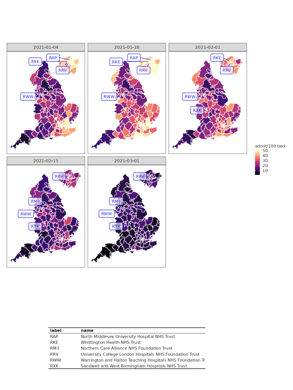
One part of the response to this is the labeller function, which allows adding the same labels to another map. In this case we create a new popout of the basic LAD19 map and apply the labels from the previous step. The facets from the previous map are preserved.
ggplot(
    arear::popoutArea(
      lad %>% filter(stringr::str_starts(code,"E"))
    )
  )+
  geom_sf(size = 0.1)+tmp$labeller()+facet_wrap(vars(date))
#> although coordinates are longitude/latitude, st_union assumes that they are
#> planar
#> although coordinates are longitude/latitude, st_intersection assumes that they
#> are planar
#> Warning: attribute variables are assumed to be spatially constant throughout
#> all geometries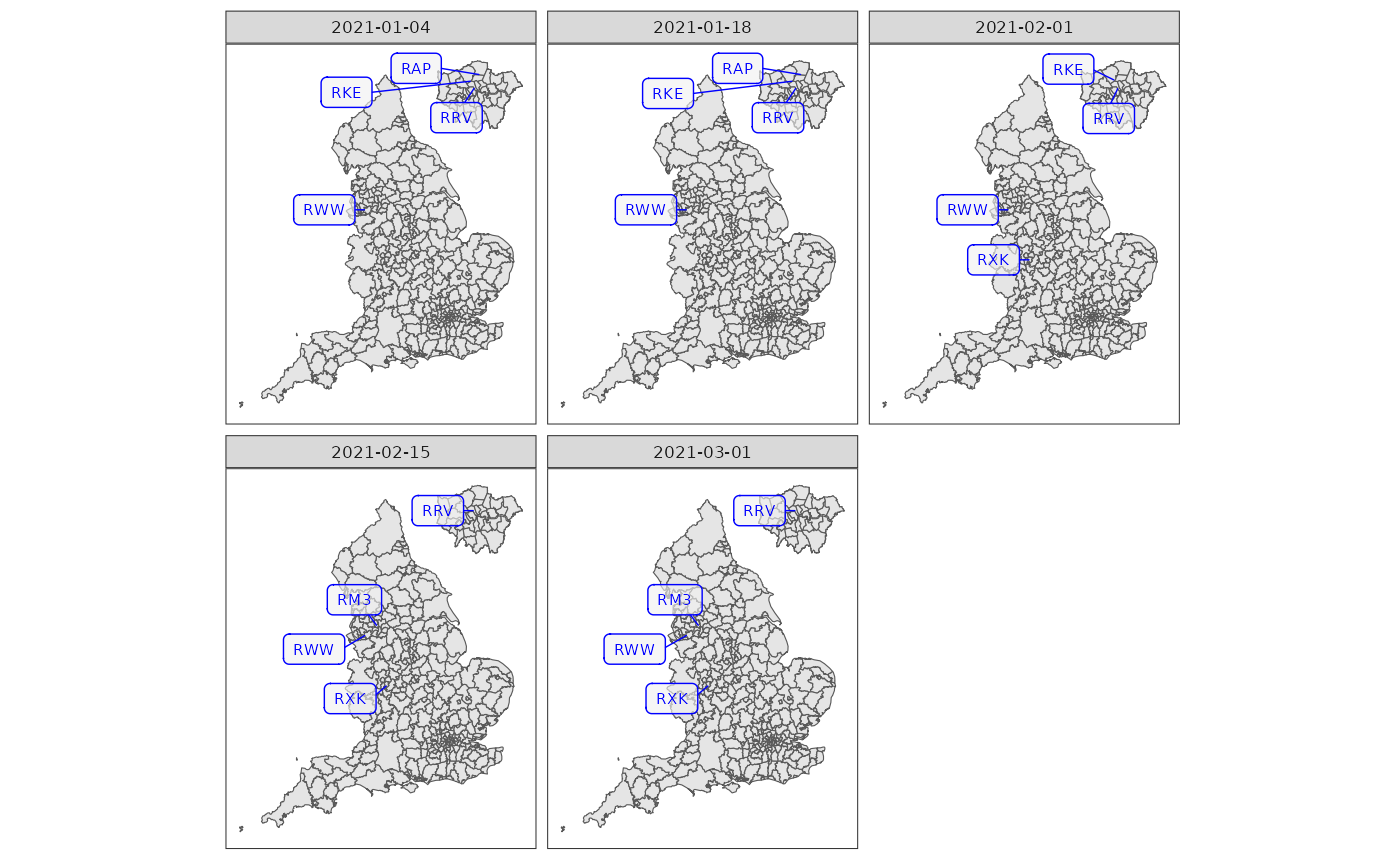
The library is continuously evolving.